A Hotel to Come Home to

Author: gje Page 3 of 7

Just Fantastic!

Guest review at Tripadvisor of April 20, 2010:

We stayed at Haagsche Suites in March 2010. We were warmly welcomed by Guido, and given the tour of the suite.

The suite (no 2) is stunningly beautiful, everything you can wish for. Great breakfast served in the room. The atmosphere is calm, no stress, and you feel almost like home.

We were met with the same kindness by the other host Irene.

We absolutely recommend Haagsche Suites for a romantic stay in den Haag.

Stayed March 2010, travelled as a couple

5 van 5 sterren Waarde
4 van 5 sterren Locatie
5 van 5 sterren Slaapkwaliteit
5 van 5 sterren Kamers
5 van 5 sterren Hygiëne
5 van 5 sterren Service
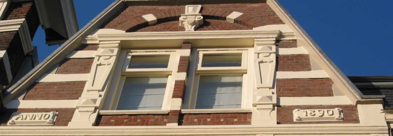
Very Nice Hotel with tasteful Interior

A tripadvisor review by a German guest of April 12, 2010

The Hotel is absolutely wonderfully decorated. I can only recommend the Hotel. It only has three rooms which I think is a great advantage.

The rooms are spacious, the bath big, and you’ll have your own kitchen with a great coffee maker (hightec sort of gadget).

If you don’t need a lot of people to make you happy, go here.

It is not a full blown hotel but a small privately owned house with very nice and thoughtful hosts.

Stayed April 2010, travelled with family

5 of 5 stars Value
5 of 5 stars Location
5 of 5 stars Sleep Quality

5 of 5 stars Rooms
5 of 5 stars Cleanliness
5 of 5 stars Service

http://www.tripadvisor.co.uk/ShowUserReviews-g188633-d543080-r61109815-Haagsche_Suites-The_Hague_South_Holland_Province.html#

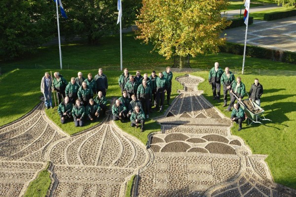
Keukenhof Open Air Flower Exhibition open from March 18 – May 16, 2010

Today the 2010 Keukenhof open air flower exhibition in Lisse has been officially opened by Mrs Svetlana Medvedeva, wife of the President of the Russian Federation, in the presence of Her Royal Highness Princess Máxima of the Netherlands.

Seven million flower bulbs have been planted in the 32 hectare park. This year’s theme is From Russia with Love.

The park will be open to the public from Thursday 18 March up to and including Sunday 16 May 2010. The best time to visit it is Either very early at 8.00 AM or at around 3.00 PM after the buses full with tourists will have left. It is open till 7.30 AM, but you should enter before 6:00 PM, because the ticket office closes then.

The Keukenhof is about 30-45 minutes by car form Haagsche Suites.

What is slowing down the Site Transition?

slow as a snail
The transition process from old to new site has been slowed down considerably, mainly for the following reasons:

  1. First various hiccups and days down at our ISP provider. I must say that I am very disappointed with them. After more than two years hosting my blog Happy Hotelier without hardly any such problems, I decided to move my sites to them and then all of a sudden I count 4 whole days of non service for various reasons in the past three months. Not acceptable. Off course I’m looking for alternatives, but haven’t found them yet….
  2. Secondly I’m having troubles with my channel manager. “What is a channel manager?” you will ask. A channel manager is a way of keeping your room inventory up to date in one place. From that inventory there are several sites where the rooms can be booked. If, as a small hotel, you don’t maintain your inventory in one place, the risk is high that you are getting overbooked. If you like to maintain a top level of service, you will understand that you will be having a lot of egg on your face if guests come with a reservation to find you have no rooms available for them. I believe that would be the worst possible experience for a guest
  3. Still I haven’t decided about the language issue. I have a feeling that at least there should be a mirror of this site in the Dutch language, my native language, because when I look at the Dutch Google translations of this site, it doesn’t make sense. I fear the same with other languages…but a new version of the plugin has arrived. Let’s see whether that works better.
  4. Design issues. There is a new version of the framework for this site to arrive soon. Hopefully I need less hacking around with that new version than I need to do now to further the site’s look and feel
  5. One of the major issues is the widget for the availability of our suites. I want to incorporate that on every page of this site in a manner that is easier for our visitors…I need more asking around to get what I want
  6. And finally a very good reason: We are getting more and more guests in the first three months of 2010!

Photo found on Freaking News

A bit more Color added and a Language Question

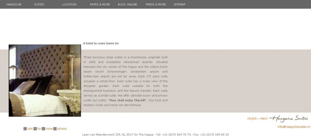
Nostalgia screen shot of our static site HaagscheSuites.nl

After the unpleasantness of the hack and other duties, I just had some time to consider the color scheme of the new site. This is very easy to do and very easy to change with the Thesis theme I’m using.

I’ve made a screen shot of the soon to be old site that served us so well for over 8 years. I was so proud of it, because:

Much thought had gone into:

  1. Very fast loading, essential when many people were still on very slow internet connections, but even essential now with high sped internet access of nowadays: People tend to get less patient.
  2. Showing as many photos as possible without slowing down the loading speed of the page. We preloaded them..nifty.
  3. Address and telephone numbers of Haagsche Suites on every page for easy reference for our guests.
  4. Even the e-mail address was always shown, despite everybody warning against it. Mail spam had to be handled with spam filters in our mailbox.
  5. When applied, I thought the drop-down menus were a killer application. They enabled us to keep all the links within the one-page-without-scrolling principle we tried to maintain. The only disadvantage of a drop-down menu is that not every user appreciates it. I’ll have to think about that as well here.
  6. The color scheme worked fine. Easy to read and just a bit different of the rest of the hotel sites. Before going wild on colors I will just bring the colors her close to the old scheme.
  7. One of the big brain breakers is how to have your site in two languages. We used to have an English language landing page and each page linked to the Dutch equivalent and vise versa.

Bear with me:-)
What is wise for the new site: To concentrate all languages at one url here (the .com one) or to put the English language part at the url here with the .com extension and the Dutch language part at the url with the .nl extension? Do you have any ideas?

Page 3 of 7

Powered by WordPress & Theme by Anders Norén